The challenge
All traffic, no leads
Not-for-profit healthcare provider Benenden Health were pushing themselves with a stretch target of increased yearly leads. They were getting a lot of traffic from TV campaigns, but this traffic wasn't necessarily converting into leads.
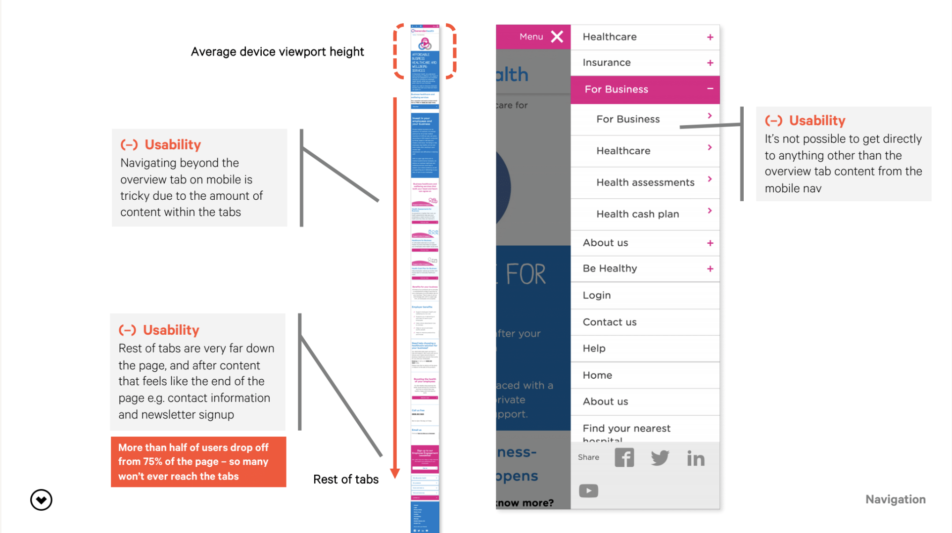
I conducted an expert review which showed there were numerous usability and accessibility issues that could be addressed, but after the CRO team ran some surveys on the site it also became clear that people were struggling to understand Benenden's core proposition.
Incremental test and learn
Over a year, I worked closely with our data analyst and optimisation specialist to design A/B tests across the B2C journey looking to improve areas on the form, but also to grow our understanding of what information and to what level was important to users, for example around the inclusions of the healthcare product.
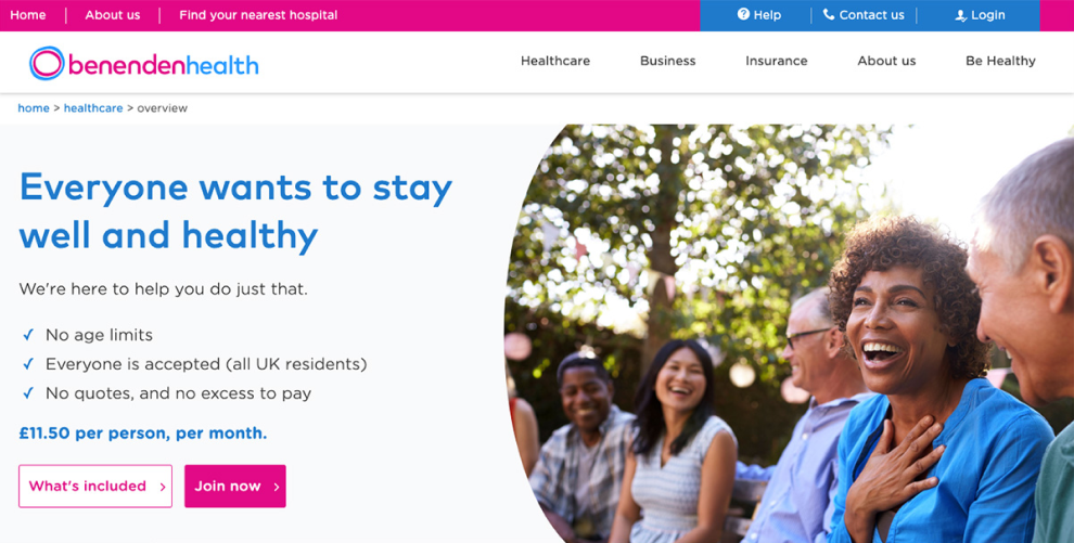
Healthcare redesign
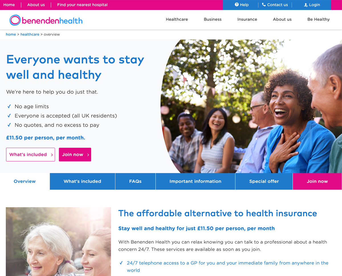
In January 2020, we launched an A/B test changing the entire B2C healthcare section of the Benenden Health site. This was a multi-hypothesis test and the culmination of a year’s worth of research and experimentation where we gained a lot of insight into a user’s understanding of Benenden and the type of information they were looking for. We had observed:
- people struggle to understand the proposition and what was included
- usability issues across the site
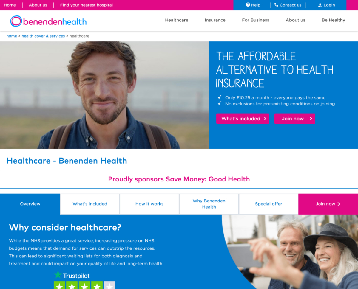
- a positive effect from implementing a clearer layout on the B2B healthcare pages
Approach
I co-facilitated a co-design content workshop with the client, where as a group we used our insight and their subject matter expertise to start laying out content in a better hierarchy. I took this into production of a mid-fidelity prototype for lab research. I designed the prototype in Sketch, then built it into VWO (our A/B testing tool) so the prototype loaded directly into the site giving users a seamless experience if they visited pages not directly in our test.
I observed, took notes in a matrix and analysed the results of testing to take into a second interation we'd test quantatively on-site.
Round two
In the usability testing, I tried to keep existing components from the current site as our client's tech team had quite a large backlog and we were conscious of creating work that wouldn't be built. However, after testing it was clear to me this just wasn’t going to work. There were fundamental issues with lots of their existing components and we now had usability testing insight to back that up, we needed to make bigger changes if we wanted to get the big results we knew we could get.
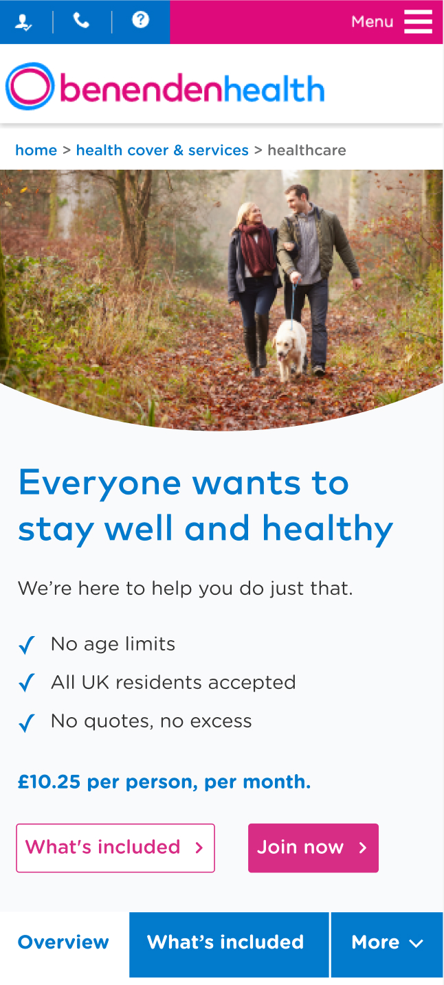
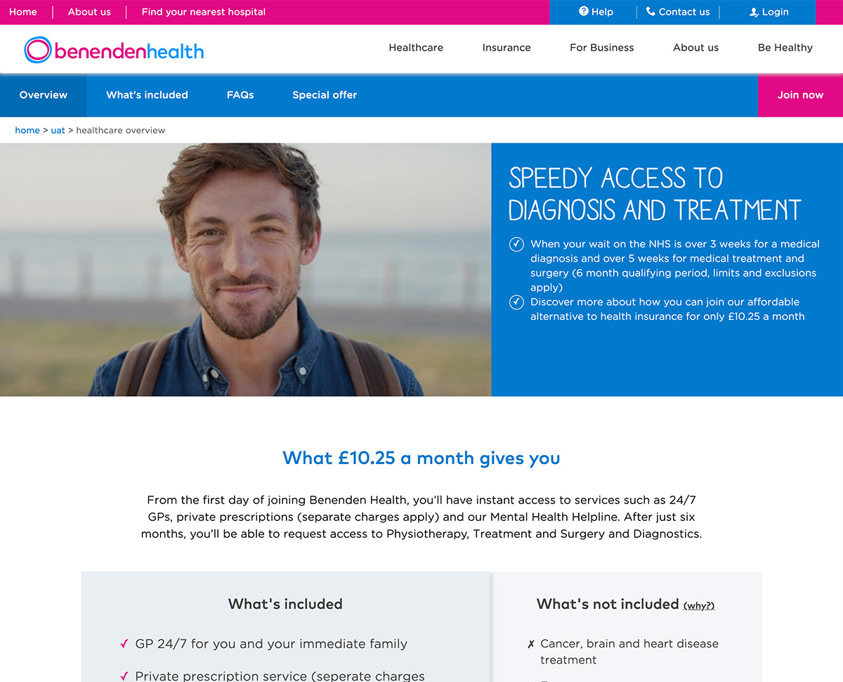
I designed and built a second iteration, this time in high-fidelity. I addressed multiple UX issues, but also focused on improving the visual design:
- removed the hard-to-read and forced uppercase font used in the hero and swapping to their core headings font for better legibility
- created better hierarchy for button usage, with the solid pink used for primary CTAs and the inverse for secondary buttons
- curved image in the hero for better brand alignment
We chose to quantitatively test on-site, so I built the new design into VWO test updated versions of all 5 pages against their original control pages.
Results
The proof is in the metrics
The big test paid off. Online join conversions improved by 15.2%, with a whopping 23.1% increase on mobile. This worked out at 471 additional joins per month.
I created a prioritised actions list for the client to take away so when implementing changes they could start with the most impactful first.
After this, our client also asked us to do a small art direction piece and produce a style guide for the website.